
Floral birthday card tutorial
Affiliate links: You support my business whenever you click on a link and buy something, and it doesn’t cost you a penny extra.

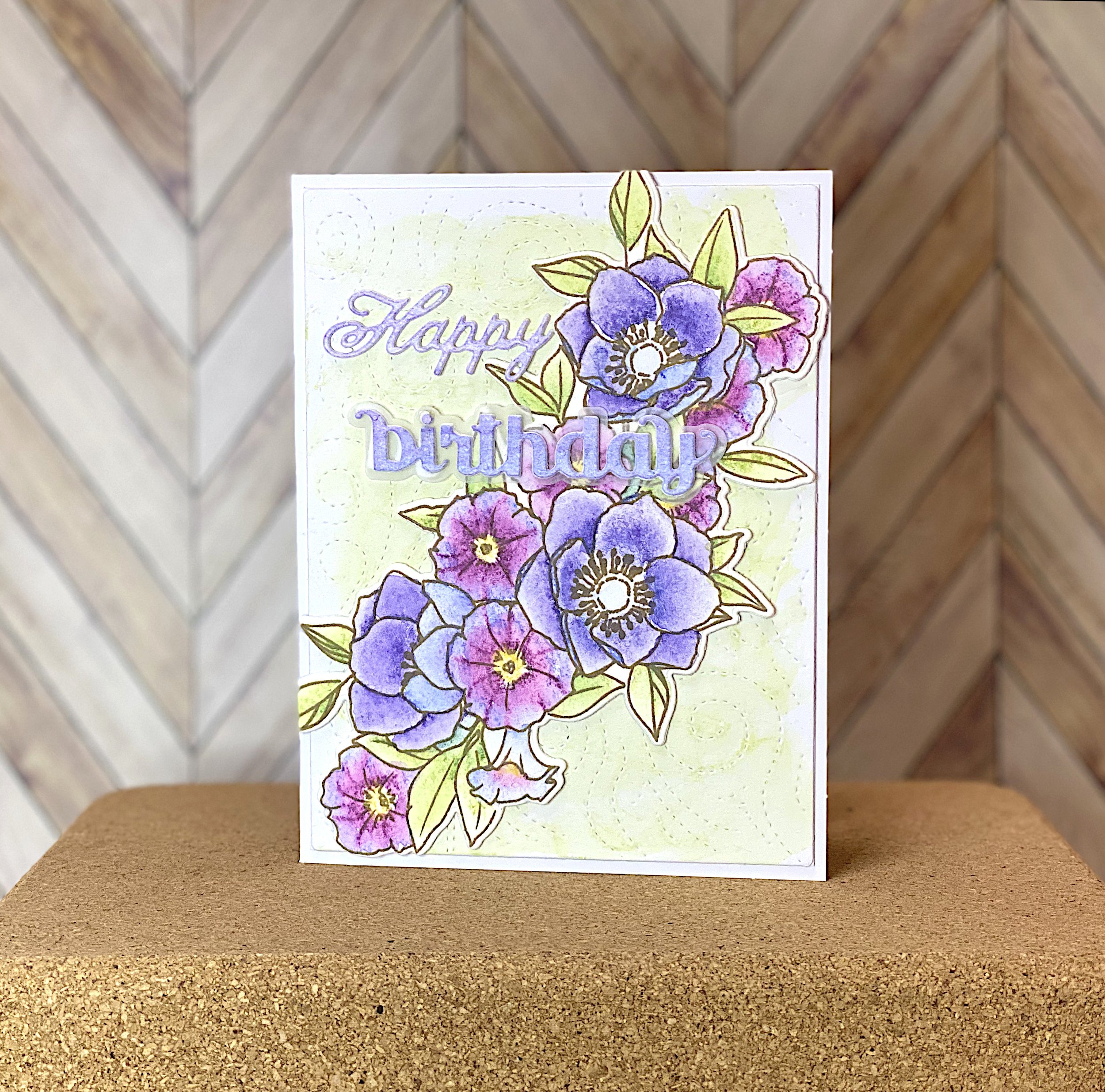
The finished card with matching background and die cut sentiment
The theme for the first week of Instagram collab hosted by That Crafty Golden was a floral birthday card. Flowers and birthdays are the most common card subjects, so it’s a great theme to start with. Many of us, myself included, are new to Instagram hops. So there were a lot of technical things to figure out with scheduling posts, tagging people and so on. I was grateful that the card itself was something I’m very familiar with.
For my design, I chose to go the conventional route with a big flower arrangement and a die cut sentiment. The stamp and die set is Kind Soul by W+9. I love coloring big, bold arrangements like this one.
Tips for coloring flowers
Stamp the image multiple times, so you can practice.
Identify the flowers and search Google for their names.
Go to the Images tab to see lots of images to use as inspiration.
Look for commonalities in the images. If you paint what’s typical, people will recognize the flower and your coloring will appear realistic to them.
Some questions to ask as you look at flower images:
What are typical petal colors and markings? Are they paper thin, leathery or more fleshy?
Typical flower center colors and arrangements?
Bud shapes and colors at different stages of development?
Typical leaf colors? Are the leaves shiny or matte? Are veins visible? What pattern do they form?
If in doubt, both petals and leaves usually have a more intense color closer to the stem.
If the petals are spotted or striped, the pattern is usually denser near the flower center.
Petals often have pale edges.
The underside of petals are usually a paler or less saturated color than the top.

Watercolor pencil with darker shading toward center of flowers
The flowers in this arrangement are anemones and petunias - both very common flowers. Purple is a common color for them both. I colored them with Distress watercolor pencils. Distress watercolor pencils are becoming my go-to for coloring. They’re just so easy to work with. I’m hoping that Ranger will come out with more colors, because the palette feels a little limited so far.
I wanted the background to have some interest, so I used a piercing die and then scribbled the same pencil I used for the leaves on it. Then I dissolved the paint with some water on a brush, to create a messy low-contrast background. I think it serves to anchor the floral image to the card.
I cut out the floral arrangement, doubled it up and adhered it diagonally across the watercolor background.
Happy Birthday
Then I used the flower colors on a scrap of cardstock and cut out the matching sentiment from it. That’s why the sentiment matches the flowers.
“Happy Birthday” is by far the most common sentiment for greeting cards. If you only have one way of creating it, you’re going to get sick of it. So it’s a good idea to have a couple of different versions.
The font combination in my sentiment is a tried and true choice, with “Happy” is in a script font and “Birthday” in a san serif font. My “Happy” is from a crafty company that went out of business many years ago now. Here’s a more up-to date Happy from Spellbinders. Here’s an all-in-one die and the go-big-or-go-home version.
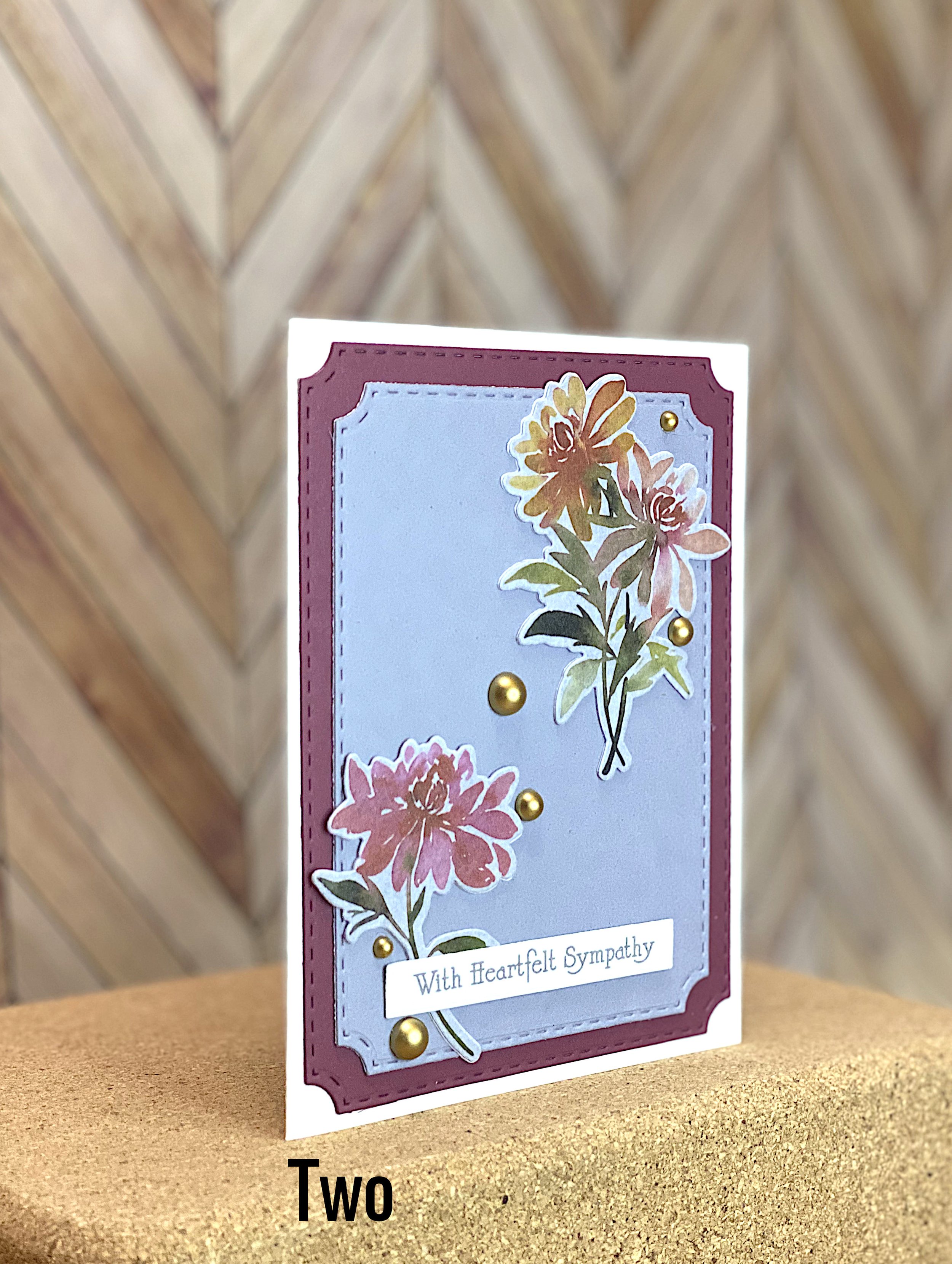
New in the Shop